


You Need Lines In Order To Read Between.
Insights Are Just That, In

August 14th. 2023
The future is in the eye of the beholder or, at least, when it comes to projecting Treasury yields, where you start to look at them and how many lines you place on the chart.
We tend to shy away from homing in one particular yield, not only because we respect the art and science of technical analysis too much, but also because we believe that yields are insightful when comparing and contrasting them to other yields, typically of the same quality. That’s a long way to say that we prefer sp|READ|s because whenever you have to infer something important you always have to “read between the lines” (see what we did there?). Nevertheless, a lot of other economic content providers don’t feel this way and, in the hopes of driving views, are more than happy to sacrifice the integrity of the information for a quick click. Therefore, we thought we would very quickly provide not one chart with one line but three charts with three lines in order to drive our point. Notice the data is exactly the same on all three charts so the question isn’t necessarily which one will you choose to look at but rather should be why did we use the constraints that we did? To give you some insight into how we approach these things, here are some questions we’d ask ourselves.
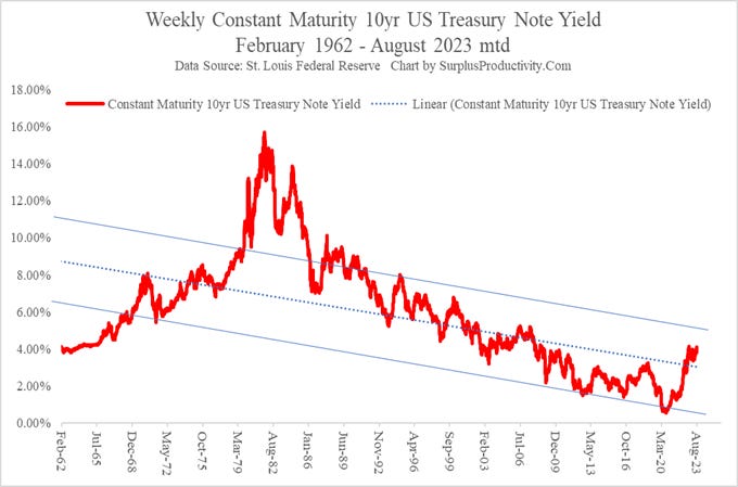
Weekly 10yr CMT yield with a linear trend line and channel.

Keep reading with a 7-day free trial
Subscribe to SurplusProductivity.Com to keep reading this post and get 7 days of free access to the full post archives.